Complete Guide Overview
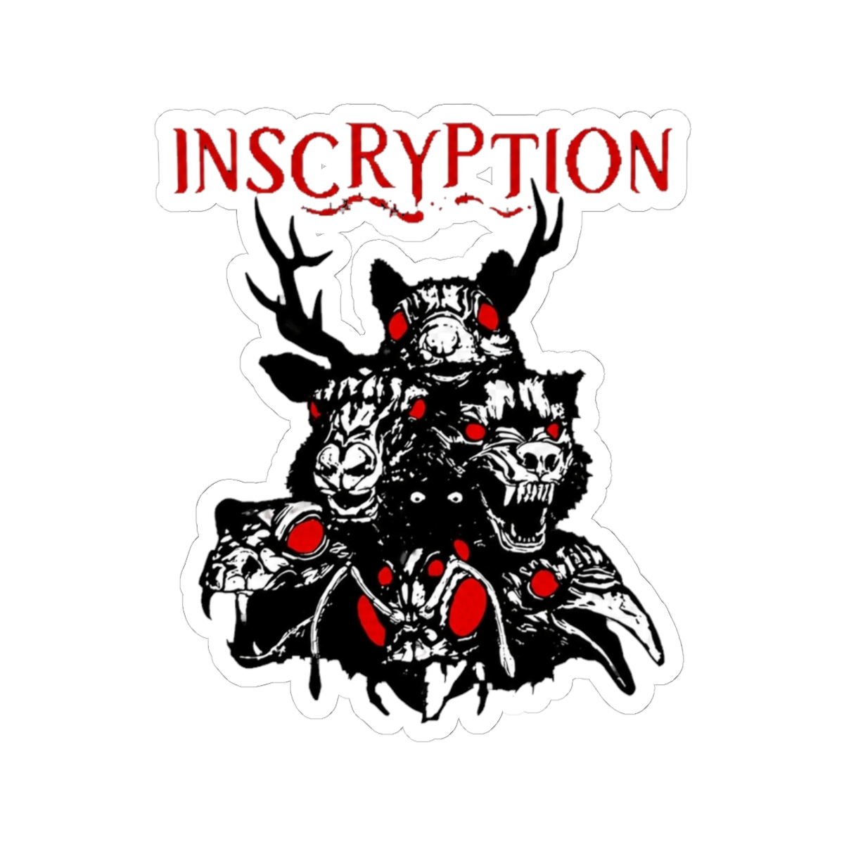
Search "inscryption logo" and you get a mess: a low-res PNG of the title, three different versions of the Ouroboros, a tattoo photo, and a Reddit thread arguing about which sigil belongs to which Scrybe. The confusion makes sense once you realize Inscryption doesn't have one logo. It has a wordmark and a family of marks, and fans use each one for different things.
Here's the short version. The wordmark is the INSCRYPTION lettering itself. Everything else - the Ouroboros, the four Scrybe sigils, the dark coat silhouette - is iconography that sits beside the wordmark rather than replacing it. That distinction matters the moment you're picking something to wear or stick on a laptop, because marks that read fine at 300 pixels wide fall apart at two inches.
The Wordmark: Weathered Serif, Ink on Bone
The title lettering looks pressed rather than drawn. An old-style serif with worn edges, off-white against black, closer to a letterpress impression on rough paper than a clean digital typeface. That texture is the point. Inscryption frames itself as a recovered file - a game pulled off a floppy disk by a card-channel YouTuber named Luke Carder. Lettering that looks like it survived a decade in a basement fits that framing better than anything crisp would.
Two practical notes if you're working with the wordmark. The thin strokes in the serifs clog below roughly 40 pixels tall, so it's a bad fit for a favicon, a small decal, or an embroidered patch. And there's no public brand kit - Daniel Mullins Games and Devolver Digital haven't published an official vector file. If you need a clean version, pull from the Steam capsule art at the highest resolution available and trace it. Don't sell what you trace.
The Ouroboros and the Card Frame
The snake swallowing its tail is the mark people most often mistake for the logo. It shows up on card backs, in the endless Act 1 run added by Kaycee's Mod, and in the loop imagery the story keeps circling back to. Round, symmetric, self-contained - it's the most tattoo-friendly mark in the game and the easiest to reproduce by hand.
The Four Scrybe Sigils
Four small emblems, one per Scrybe: Leshy of Beasts, Grimora of the Dead, P03 of Technology, Magnificus of Magicks. The motifs lean bone and skull for Grimora, gear and circuitry for P03, antler and leaf for Leshy. Each one is stylized enough to work as a tiny logo on its own, which is why fans carve them into pumpkins and press them into wax seals.
The Black Coat
Strip away the lettering and the sigils and you're left with the silhouette - a dark coat, no face, no context. It's the most reduced version of the game's identity, and it's the one that survives shrinking. At two inches on a laptop lid, a viewer either recognizes it or doesn't. No middle ground. That's what a good mark is supposed to do.
Why These Marks Age Well
Inscryption's visual identity leans on degradation: worn paper, scratched plates, ink that bleeds. Nothing about the wordmark ties it to a design trend, which is why it still looks correct five years after the game launched on October 19, 2021 and took the Seumas McNally Grand Prize at IGF 2022. That anniversary just passed in October, which is part of why logo searches tick up every fall.